Marketing Dashboards
Project Overview
The goal of this project to showcase three powerful dashboards that can be used to improve marketing decisions. We will look at a buyer persona dashboard to understand the demographics of our customers. Next we will see a email marketing dashboard that can help us understand what type of email campaign works best and when to send them to your email lists. Finally we will look at a quick way to see which promotions are making the strongest waves when it comes to sales. These dashboards are a great tool to increase the ROI for marketing campaigns and adds value to marketing managers and salespeople to direct their attention to what is going to directly increase sales.
The datasets are sample dummy data from Google Analytics provided by SuperDataScience.
Link to Tableau Public: Tableau
Part I: Buyer Persona Dashboard
First we start off with a good way of visualizing demographic data for customers in an easy to read and interactive dashboard. Below we will go over each portion of the dashboard and how we can use it to identify who are our buying customers.
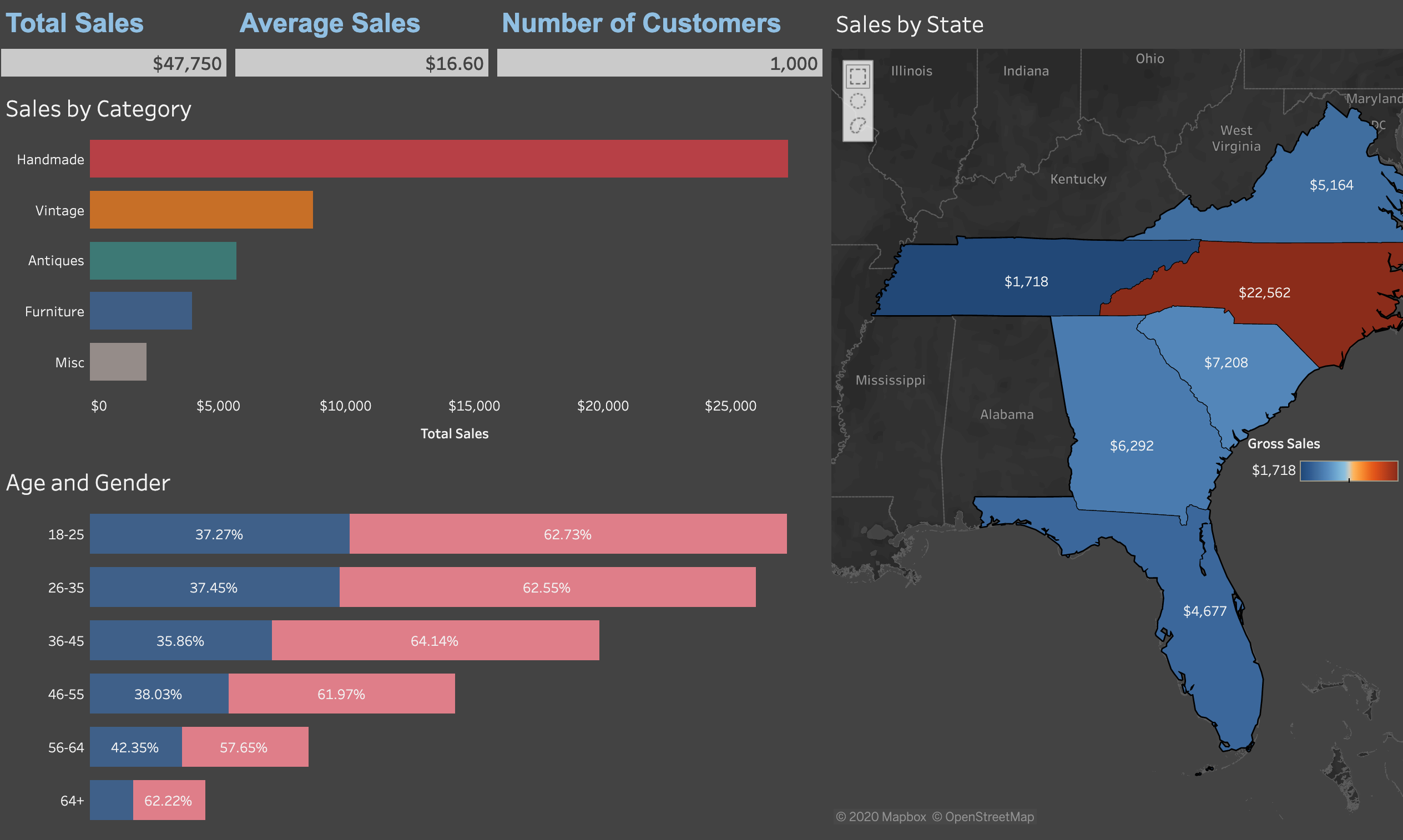
We have created individual KPIs, shown below, and place them at the top of our dashboard. I like to include these as numbers instead of in the Tooltip of the graph so it gives a good visual on what the numbers are when we start to filter the data.
These are important to have for a marketing manager or salesperson who want to get the information as quickly as possible. Without getting into the weeds, below is brief explanation of the KPIs, or Key Performance Indicators.
- Total Sales: We can use this to see what is selling the highest, where are we getting the highest sales, etc.
- Average Sale: Good indicator of the type of customers. Do they buy few expensive items, or a lot of inexpensive items?
- Number of Customers: Good when analyzing territories and seeing where we are getting the most traction for our products/service.

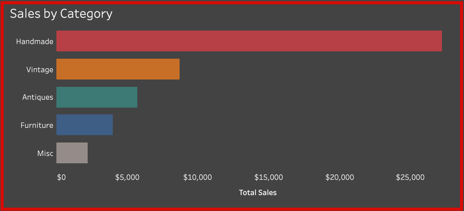
Here we have a standard bar chart showing Total Sales by the Category of items. We will be using this graph as a filter to dig deeper into the data. As we can see in this sample data, the sales of handmade items account for a bulk of the sales.
- How can we use this to isolate what items to sell more of?
- Can we start pivoting away from other items, such as vintage or furniture?
- How does this look after we start isolating data?
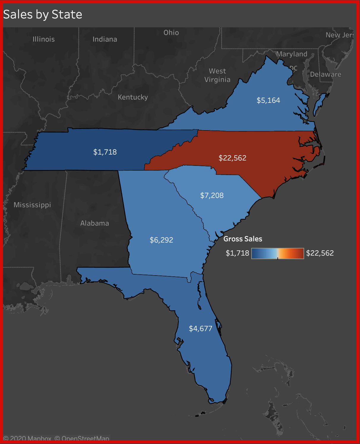
Our second visualization on this dashboard will be a map with the total sales of each state. This company seems to be mainly based in North Carolina and has stores, or sales, in the southeast. We can use this to see where our company is making headwinds and where we would need to focus on expanding.
- How can we use this map to check our Sales by Category graph from before?
- Are handmade items selling only in North Carolina?
- Why does Florida have higher sales in Furniture?
- Would pivoting away from Furniture hurt business in Florida? Should we care?
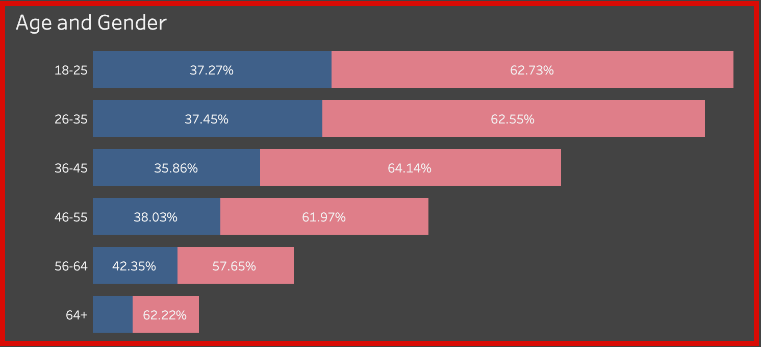
The last visualization is your standard age and gender distribution bar chart. We can use this graph to identify the age group and the gender of our customers.
- Using the two graphs from before, who do we target?
- Who are our customer base? Who should we send promotions to?
- What age group purchase high cost items?
- How can we use this information to grow sales?
Below we see the interactivity of this dashboard. As we start to click on our Sales by Category graph and/or our Sales by State map, these will filter to breakdown the data further. Is this example, we can see a majority of the customers from North Carolina that bought handmade items were 18-35 year old females.
- How can we use this for our advantage in advertising our products?
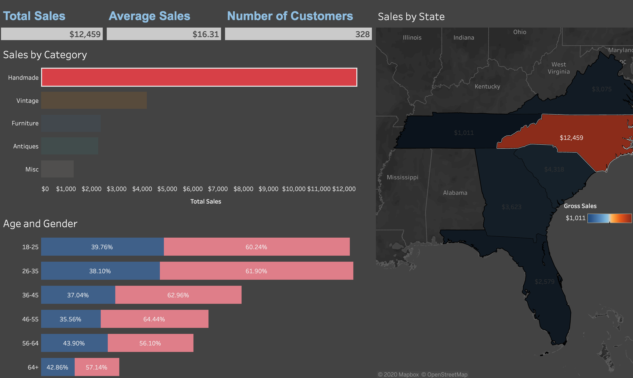
I wanted to isolate where the majority of our business was coming from. Here we see that 18-45 year old females make up about a quarter of our total sales through all our regions.
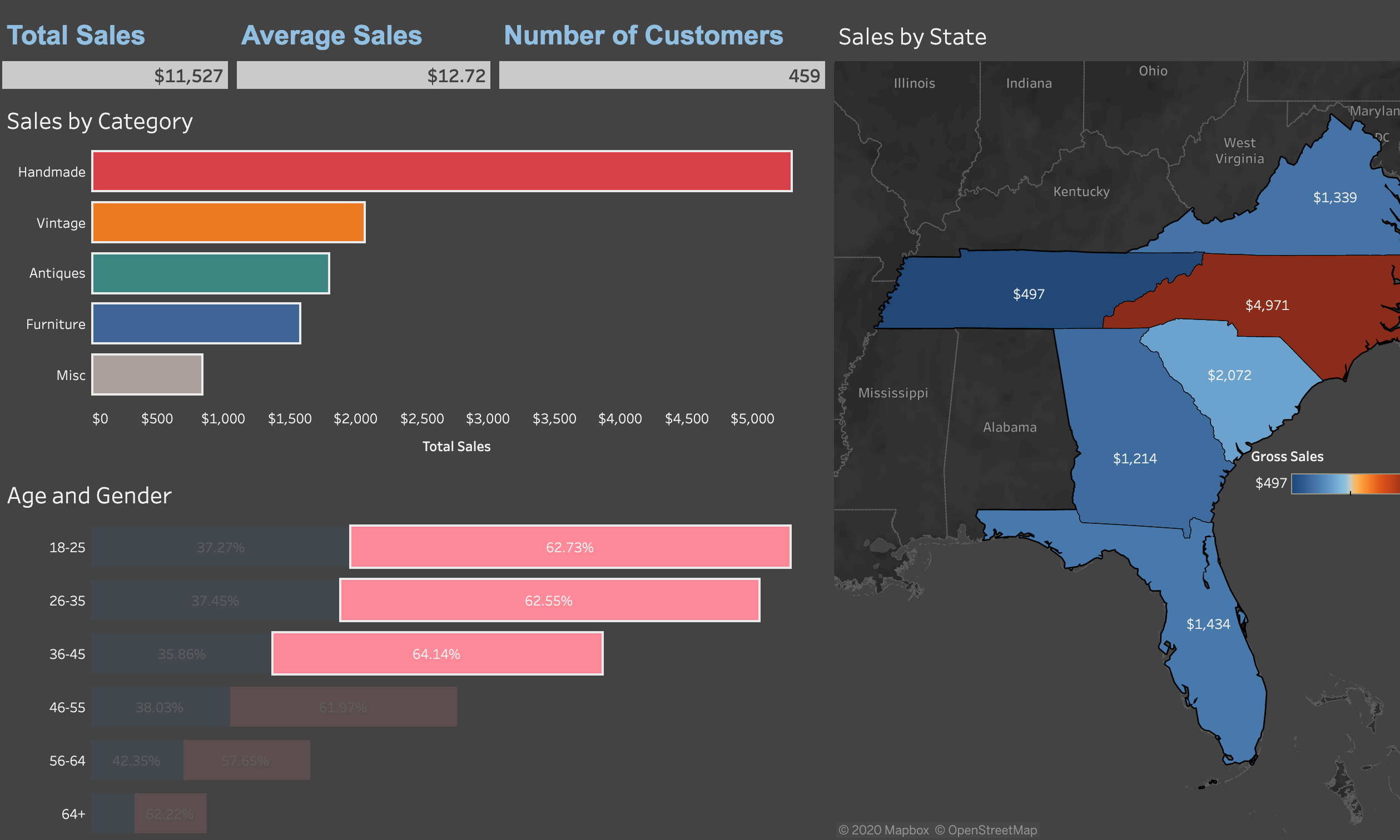
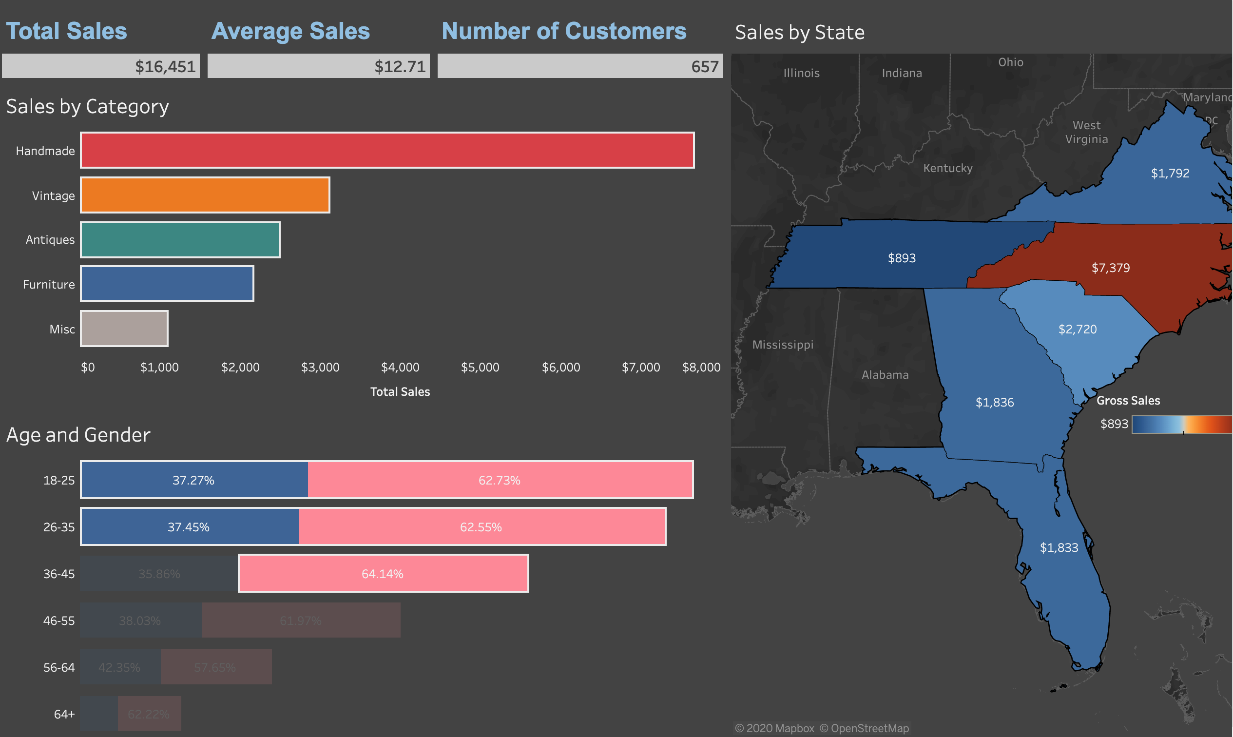
Here we take it a step further. Close to half of our total sales came from 18-45 year old females and 18-35 year old males. This should be our target demographic for our products. Marketing should focus on creating promotions, emails, content, etc. focused on what this demographic. Sales people can use this as a guide on who to focus on when customers come into the stores. Very quick to use and easy to make data based business decisions.
Part II: Email Marketing Dashboard
This next dashboard is useful for email marketing data and seeing what is working and what is not. You can also use this to test the effectiveness of our email campaigns and increasing ROI. This dashboard has three sections to it. Top portion is our KPIs, next we have visualizations to view our successes, and the bottom portion has a calendar heatmap that shows when our emails are most effective. I will show the heat map later below when I show each visualization individually.
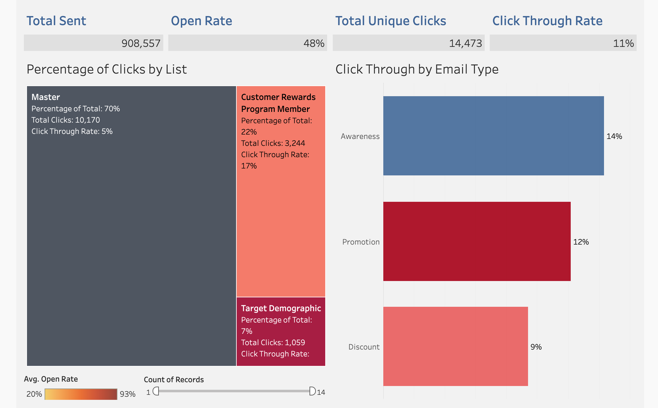
Here we see the important KPIs relating to email marketing. Each helps our marketing manager have a quick view to how their campaigns are going.
- Total Sent: Give us the total amount of emails sent out.
- Open Rate: The percentage of emails that were opened by the targets or customers. Checking emails are being opened and at least getting to a real person.
- Total Unique Click: Help us see the true amount of clicks we get from our emails. For example, this will not include a customer who clicked on the link twice.
- Click Through Rate: This is the rate of the actual amount of people who clicked on your link in the email ideally to buy. Strong indicator of the interest in your content.

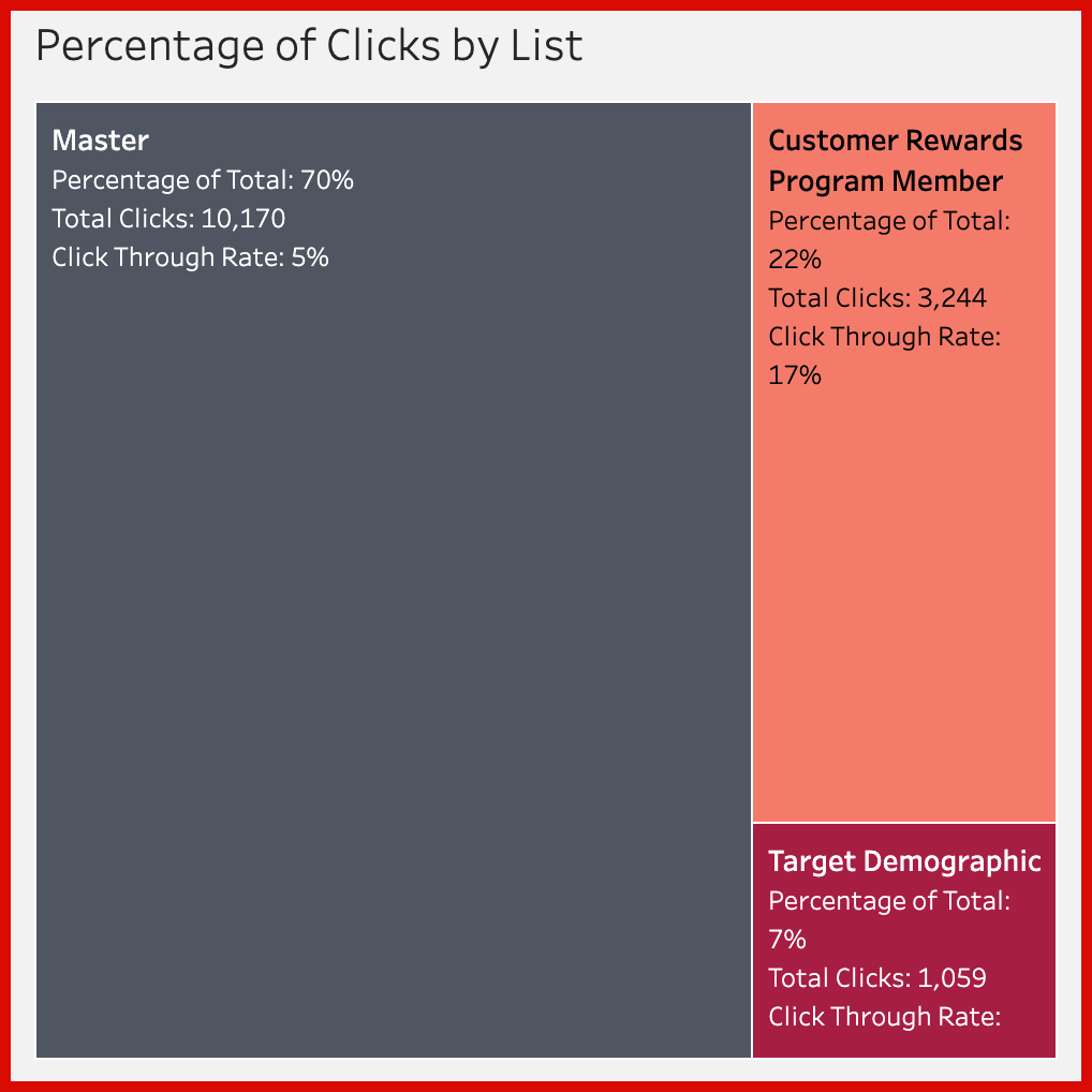
Our first visual is a TreeMap of the breakdown of our email marketing lists. We have our Master list, the Rewards Program list, and a Target Demographic list. This helps marketers determine what content to send to different targets. Very quickly we can see that the Master list, which has the most email addresses, only has a 5% Click Through Rate. Versus our Rewards Program list which has a 17% Click Through Rate. Why is that, and how can we improve this KPI?
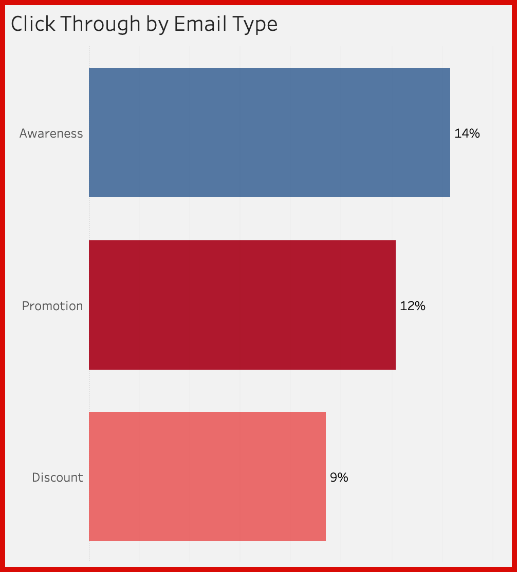
This next visualization is a breakdown of our emails based on there type and Click Through Rates. We can use this to see which type of emails, Awareness, Promotion, or Discount, have the higher success rate of customers clicking on our links inside our emails. Very powerful when it come to ROI and making sure we are focusing on marketing that is most successful.
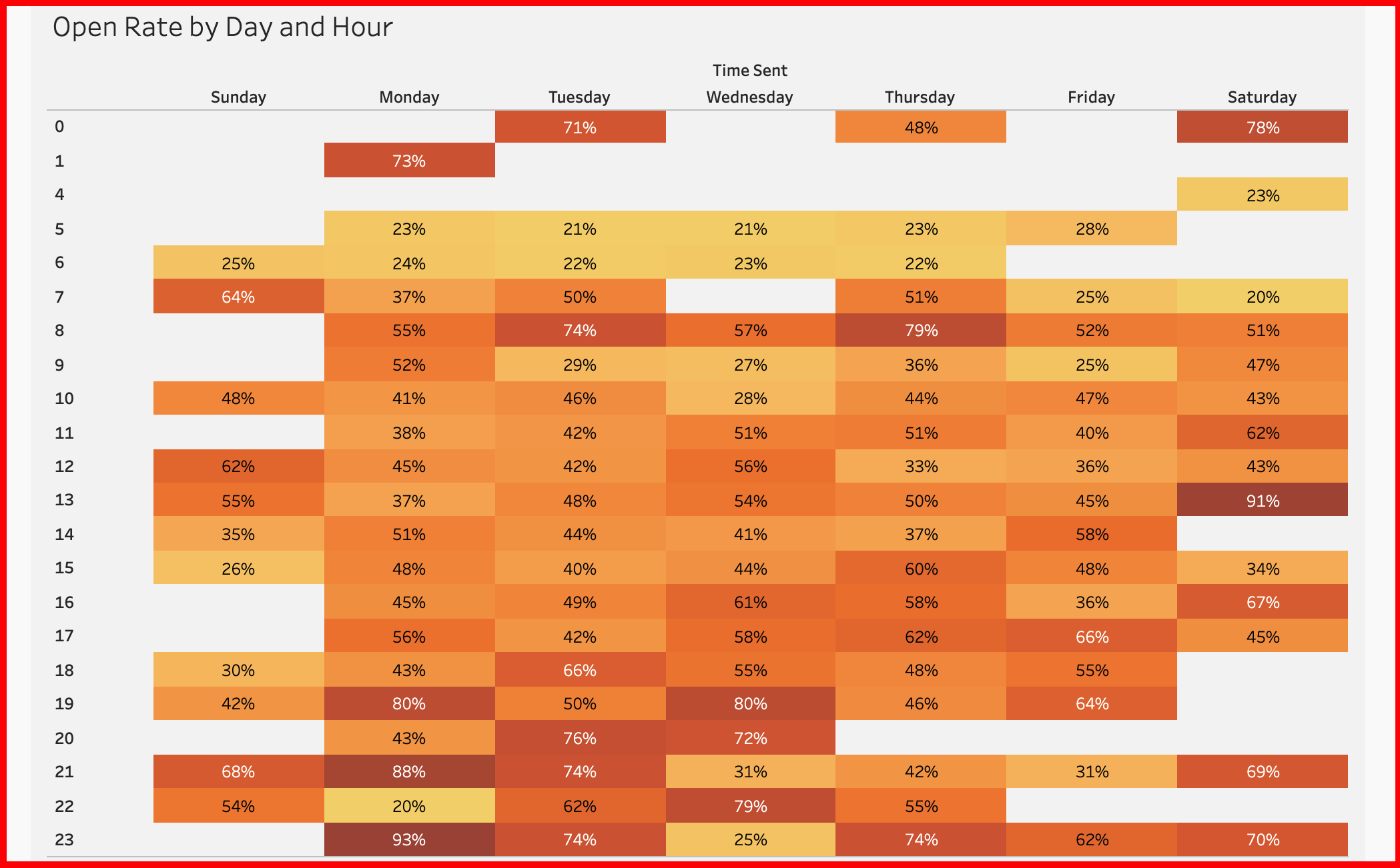
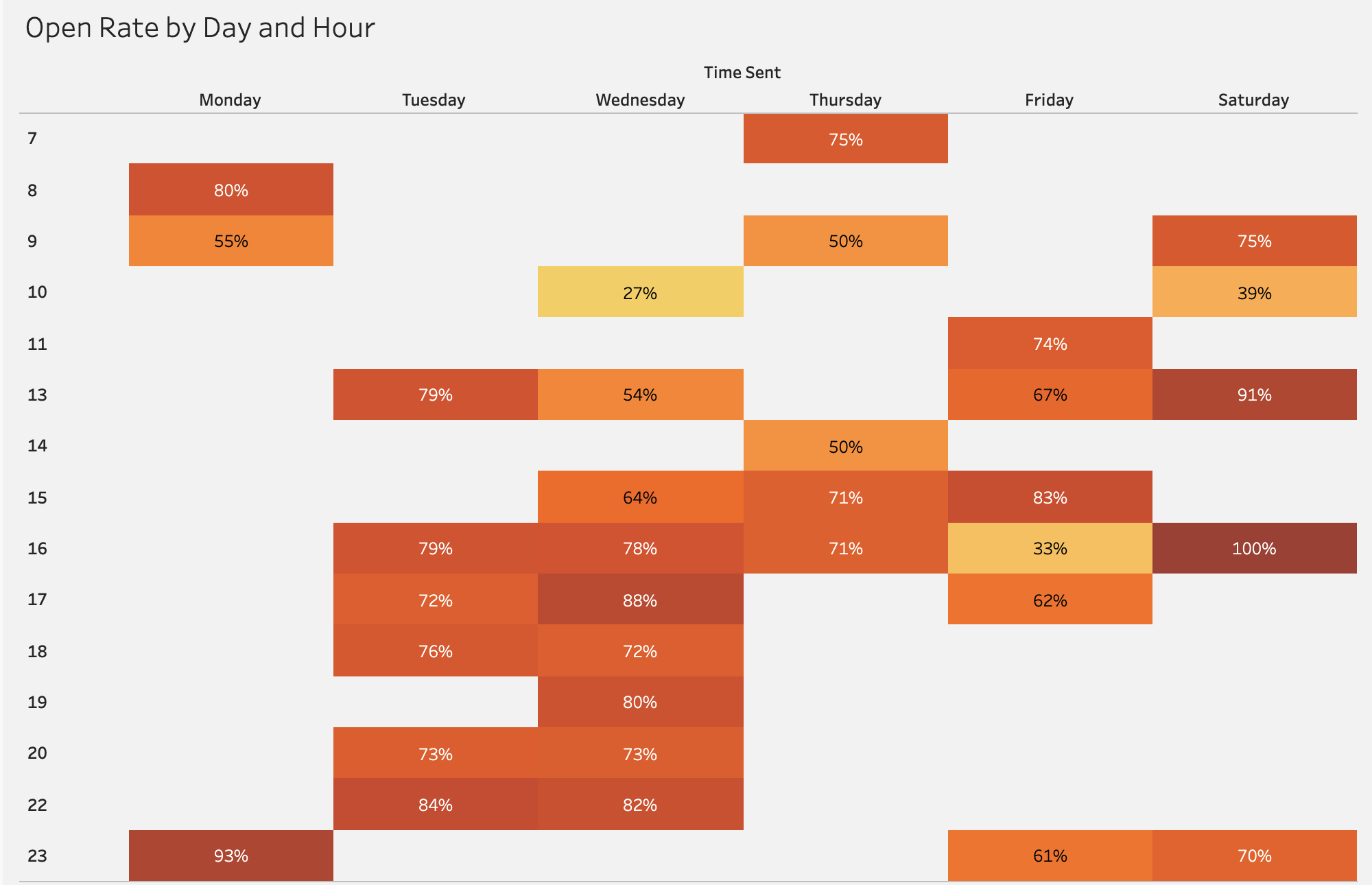
Our final visualization is one of my favorite for marketing, a calendar HeatMap! This breakdowns the date and time of emails that were sent and compares the Open Rate of each, which give us the best day and time to send our email campaigns. As we start to use the fist two visualization this will change our calendar to show the best open rates for different campaigns or emails lists.
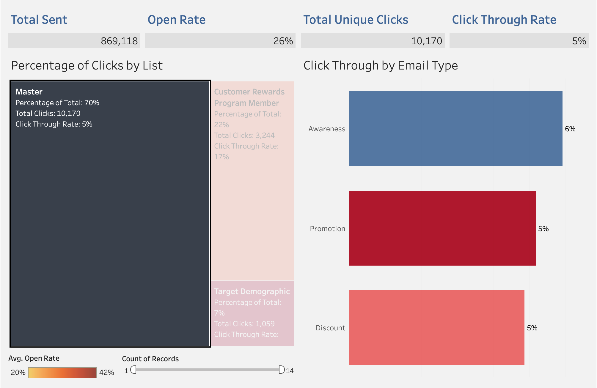
Starting off, lets look at the breakdown of the Master list versus the Rewards Program list. As we see in the Master list we have a low Click Through Rate, so very few people are clicking our links. Another key thing is that only 26% of the total emails sent are being open at all in the Master list. Why?
When we compare this to the Reward Program list, we see that they have a much higher Click Through Rate, 17% versus 5% in the Master list. Furthermore, we see that Awareness emails are extremely effective with our loyal customers at 26%. Finally, we see that the Open Rate for our loyalty customers was 67%, much higher than 26% from our Master list.
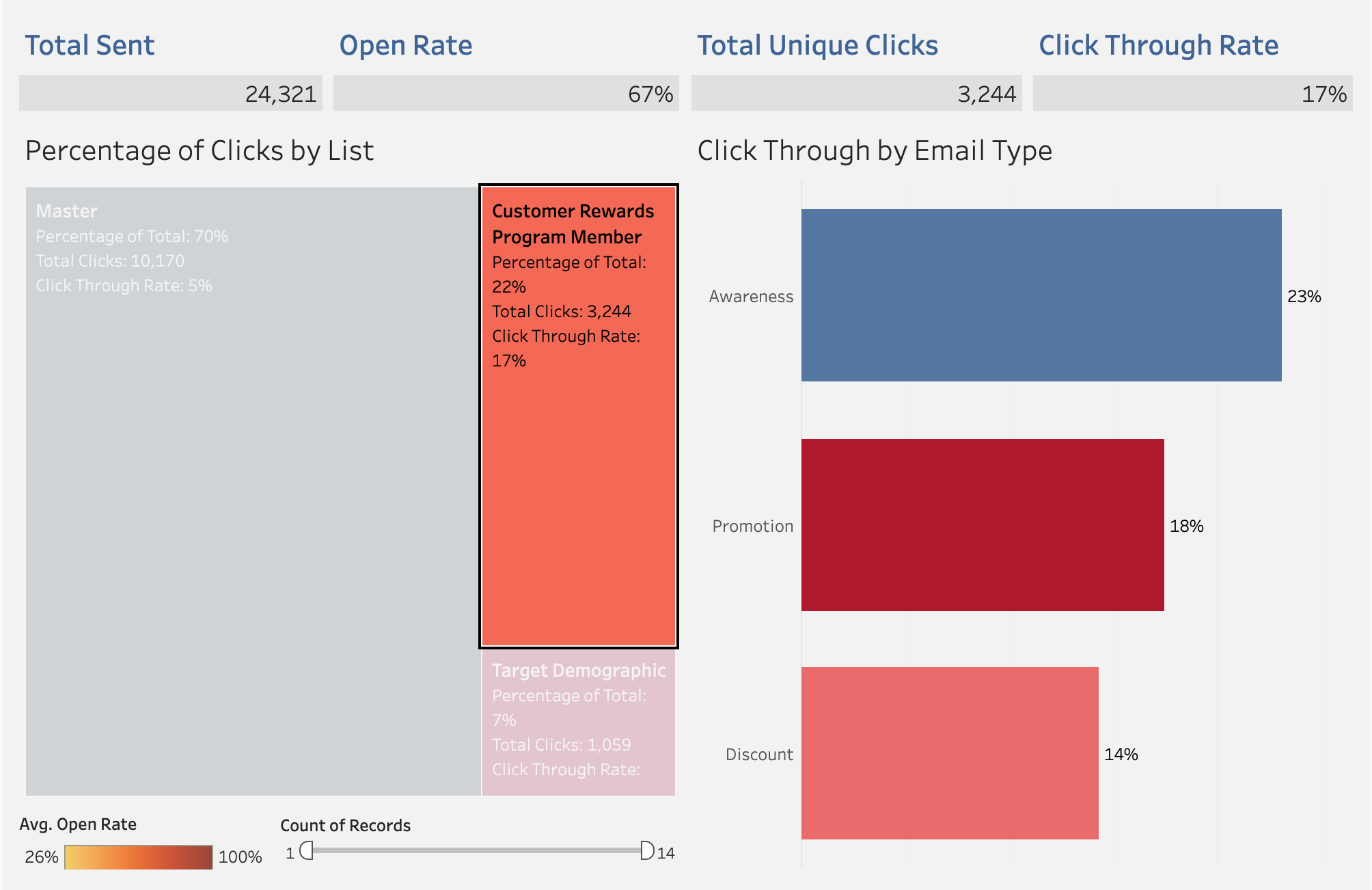
In the below scenario, the marketing manager request to find the best times to send Awareness emails to our Reward Program list customers. As we can see below, we highlighted our Reward Program list and the Awareness email type.
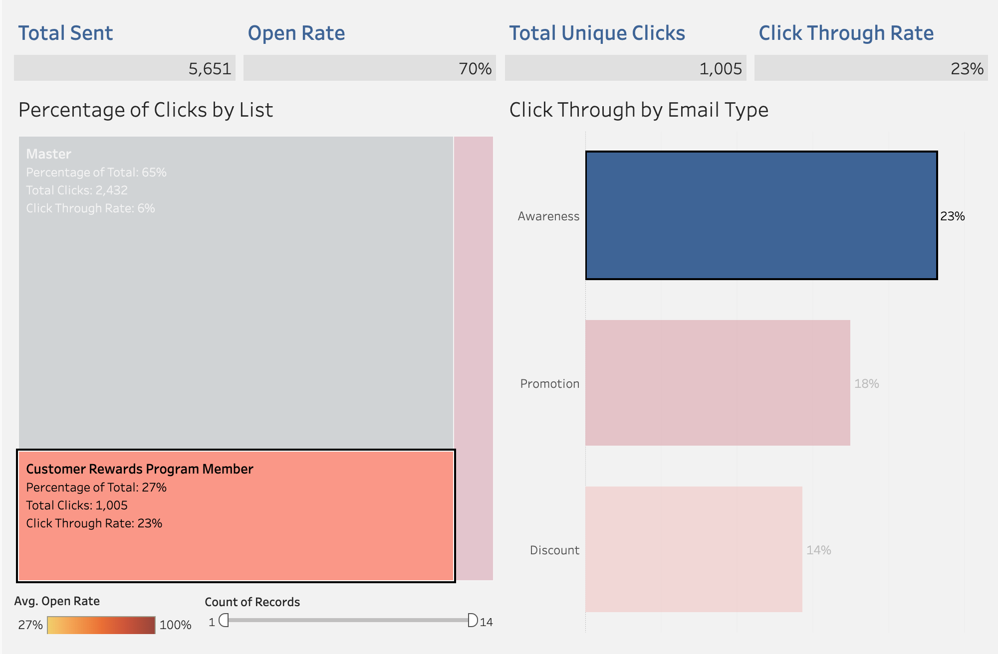
Here we see that the best time to send these would be Tuesday and Wednesday after 3pm. We also see a strong Open Rate on Saturday after 12pm. Now we can target these customer on these days to reduce excess emails and increase ROI.
Here we will answer the question, what in everything that is good in the world happened to our Master list and why do we have such low KPIs. One thing I want to throw out there first is that as this is a largest list, maybe this would be a better gauge of the true average. Maybe we got lucky with our Reward customer emails. Below we will work to check if there’s anything wrong with the list.
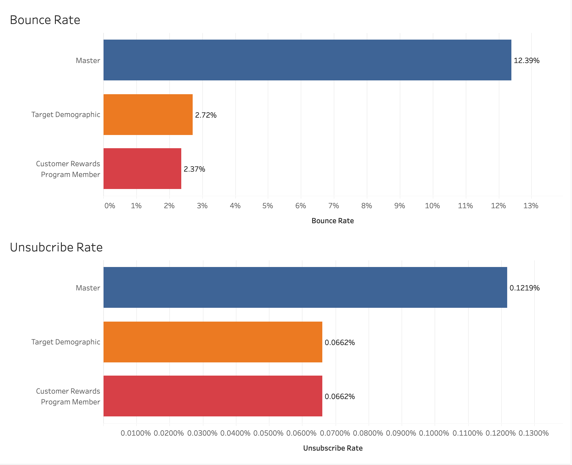
When we start comparing the Bounce Rate and Unsubscribed Rate between each email list. Bounce Rate tells us the amount of emails that get bounced back to us due to the emails being incorrect, as we can see the Master list has a higher bounce rate. Unsubscribe rate is a good indicator of our quality of content, more people are unsubscribing to our Master list than the others.
- How can we adjust our content to start improving this metric with our Master list customers?
- How can we convert them over to Reward Program customers?
- Can we start tracking the bounced emails to delete or fix them?
Part III: Promotional Impact
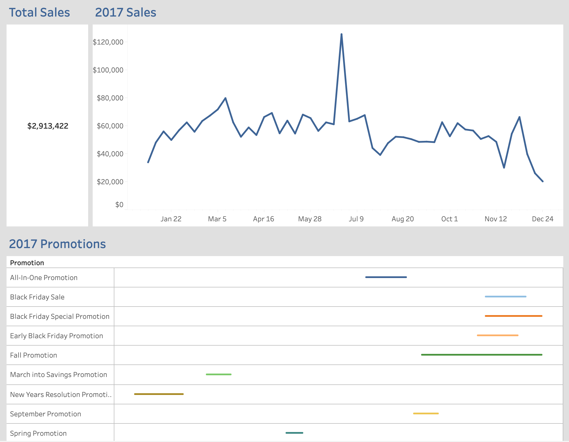
Our final marketing dashboard is going to be a shorter one but still powerful. Below is our Promotion Impact dashboard. First part we have our Total Sales KPI, next is a line graph visualizing the totals sales on a timeline, and at the bottom we have the promotions that were being run synchronized to the timeline from the line graph above.
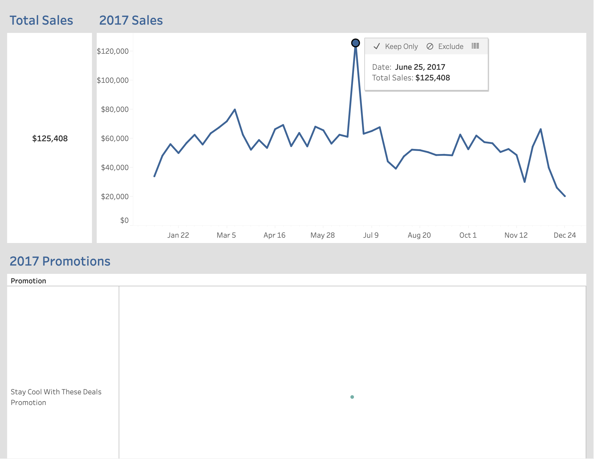
As we start to click on the top line graph it starts to isolate which promotions were contributing to the total sales on that specific day. In this situations we are trying to see what caused the substantial increase in sales for June 25. As we filter we see that the Stay Cool with These Deals promotion had a strong effect on customers.
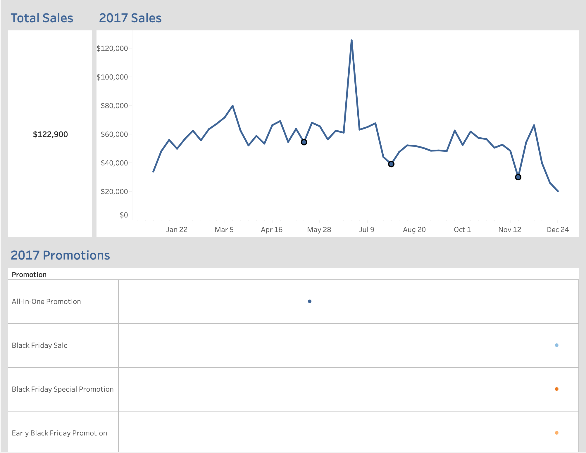
A much different effect than the below promotions highlighted that didn’t do much for our sales and in a sense loss the company money. Mainly because there was some cost to making these promotions and pushing them out to your customers.
We can use this tool to answer some important questions.
- What in the Stay Cool with These Deals promotion was different than all the others?
- Were the deals better?
- Did we send out the promotion before the weekend, in the middle of the week?
- Who did we target?
- How can we repeat this success to make sure were getting the most bang for our company’s buck?
Final Thoughts
A lot of what we believe of Data Science has been sensationalized by the idea of Machine Learning and Neural Network, but most business problems don’t need AI to solve. Most problems can be solved with a simple regression or classification model. I think we forget that what’s important in this industry is to create value for the company and to increase ROI. Full Stop. Yes we can spend hours developing a CNN to identify Dog or Cat pictures but how does that help the company increase sales or service quality.
I wanted to do this project to show some real world solutions that can be implemented to make data driven decisions in marketing. Any three of these dashboards can be delivered on a company’s website for access and can easily be used to find important information. This is what Data Science, in my opinion, is about. I come from selling Domestic Cast Iron pipe fittings in the Fire Protection industry, which is not sexy by any stretch of the imagination, but I still went out there everyday and focused on providing value to my customers.
