Global Obesity 1975-2016
Project Overview
The goal of this project is to better understand global obesity and how it has changed over the years. This dataset comes from the World Health Organization and looks at the BMI of Males, Females, and an averaged BMI for both genders. We will clean the data and do some exploratory data analysis on the data to answer questions like the ones below. I also want to create a heat map that will visualize the change over time for the countries. I will add the dataset to my Github Repo, the Gif will also be added and link to it is below.
Which countries have the highest average BMI?
How has the BMI changed over the decades?
Which countries in 2016 have a BMI higher than 30, or Obese?
Link to GitHub Repo: GitHub
Link to Tableau Visualizations: Visualization
Data Cleaning
First we import our libraries, like Pandas, NumPy, and Seaborn, with some other parameters. Next we import the data into Jupyter Notebooks and display the data to see what they provide.
# Import Libaries and Parameters for Seaborn.
import pandas as pd
import os
import matplotlib.pyplot as plt
import seaborn as sns
%matplotlib inline
plt.rcParams['figure.figsize'] = 20,20
import warnings
warnings.filterwarnings('ignore')

# Import Data
data = pd.read_csv('data.csv')
data.head(10)
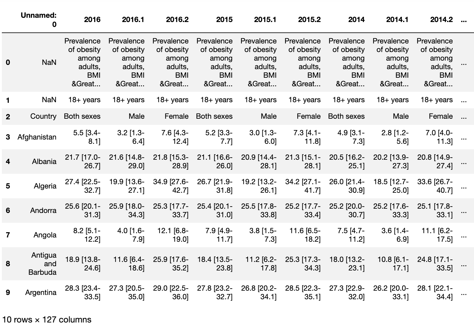
Some thing we can see off the bat is that this data is in what we call wide form, we will need to fix that. The first column is Unnamed: 0 which we will rename or drop depending on how the pivot turns out. We have 2016, 2016.1, and 2016.2 as an indicator for Male, Female, and Both Genders. The BMI has a lower estimate and a higher estimate which we will need to separate from the actual BMI.
Looking at it, I think we will rename the column before the pivot to be sure we don’t lose information. The Melt() function is a very useful way to pivot the data from wide form into long form, the latter being how computers read data versus how we read it.
# Rename Column & Preform Pivot
df = data.copy()
df.rename(columns={'Unnamed: 0':'country'}, inplace=True)
df=df.melt(id_vars=['country'],var_name='year')
Next we will drop the top three rows as they are just extra information, this will also reset the index to account for the removed rows. Our third line of code will split the year column using the '.' to create a new gender column to use theses numbers to assign the gender categories.
# Drop the first three rows and Split the year to get gender
df = df.drop([0,1,2]).reset_index()
df = df.drop(columns = ['index'])
df[['year','gender']] = df['year'].str.split('.',expand=True)
df
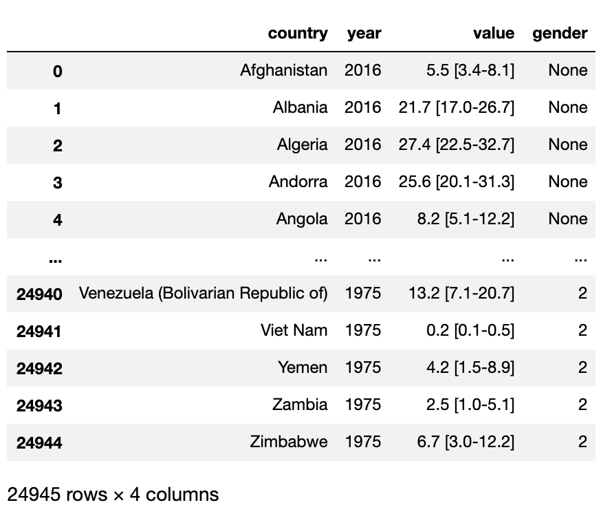
Next we will map the genders using the numbers we acquired from the split. None will be both sex, 1 will be male, and 2 will be female.
# Mapping the gender using the numbers we split
df['gender']=df['gender'].map({None:'both sex','1':'male','2':'female'})
df
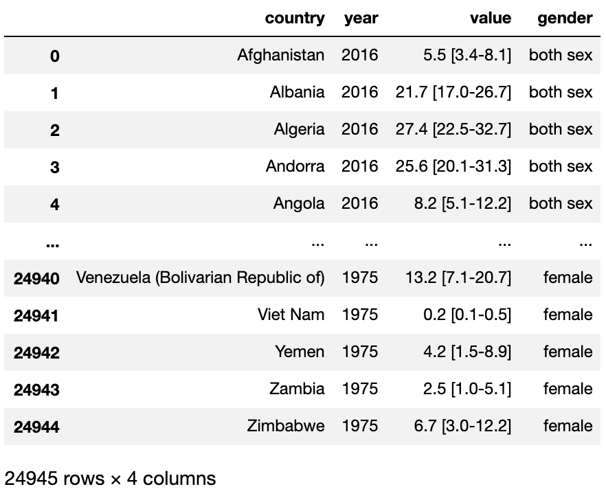
We will also use the str.split function to separate the lower and higher estimate from the averaged BMI. Using the - and [] allows us to isolate the numbers from the data. The last part reorders the columns for this new dataset.
# Seperate BMI Values
df.rename(columns = {'value': 'BMI'}, inplace=True)
df_copy = df.copy()
df['BMI'] = df_copy['BMI'].str.split('[', expand=True)
df['lowest_est_BMI'] = df_copy['BMI'].str.split('[', expand=True)[1].str.split('-', expand=True)[0]
df['highest_est_BMI'] = df_copy['BMI'].str.split('[', expand=True)[1].str.split('-', expand=True)[1].str.split(']', expand=True)[0]

# Reset the column order
df = df[['country', 'year', 'gender', 'BMI', 'lowest_est_BMI', 'highest_est_BMI']]
df
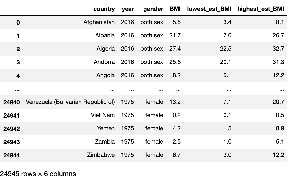
This looks pretty good and one might assume to just start doing analysis, but I like to do more checks to be sure we don’t have skewed data. Let us look at the rows with no data.
print(df[df.BMI=='No data'].country.value_counts())
We get four countries that have no data, South Sudan, Sudan, San Marino, and Monaco. The below code will remove these countries from the dataset. 879 rows were removed.
# Remove no data rows
df1=df.dropna(subset=['country'])
df1=df1.drop(df[df.country=='Country'].index)
con=df1[df1.BMI=='No data'].country.value_counts().index
df2=df1[~df1.country.isin(con)]
Now let’s look at our data types. Below we see that BMI, lowest_est_BMI, and highest_est_BMI were set as objects, we will need to switch them over to floats. The code below is one way to get this accomplished.
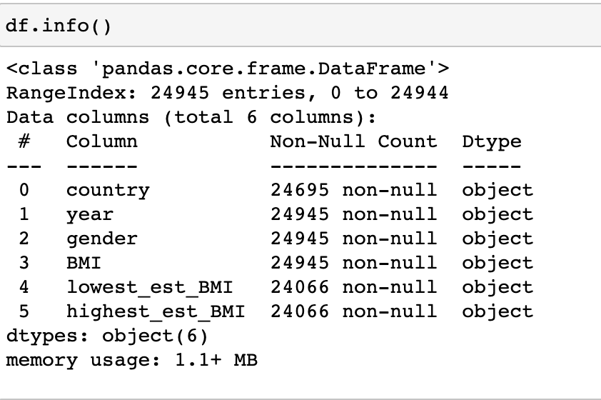
df2['BMI'] = pd.to_numeric(df2['BMI'], errors = 'coerce')
df2['lowest_est_BMI'] = pd.to_numeric(df2['lowest_est_BMI'], errors = 'coerce')
df2['highest_est_BMI'] = pd.to_numeric(df2['highest_est_BMI'], errors = 'coerce')
Now we see these set as floats.
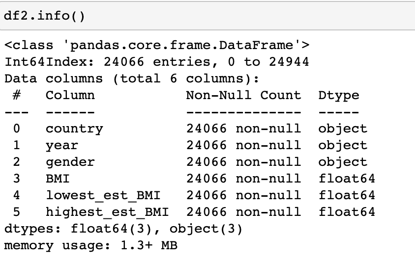
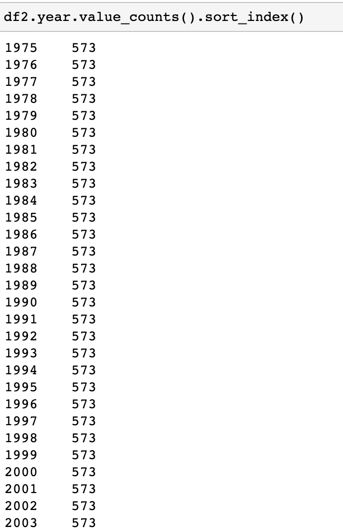
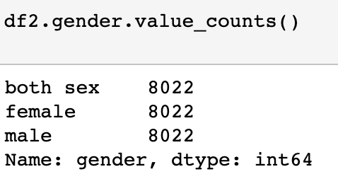
Only thing left to check is the counts on the year and gender columns. Below we see everything is looking good. Time to do some EDA!
Exploratory Data Analysis (EDA)
Distribution Change - 10 Year
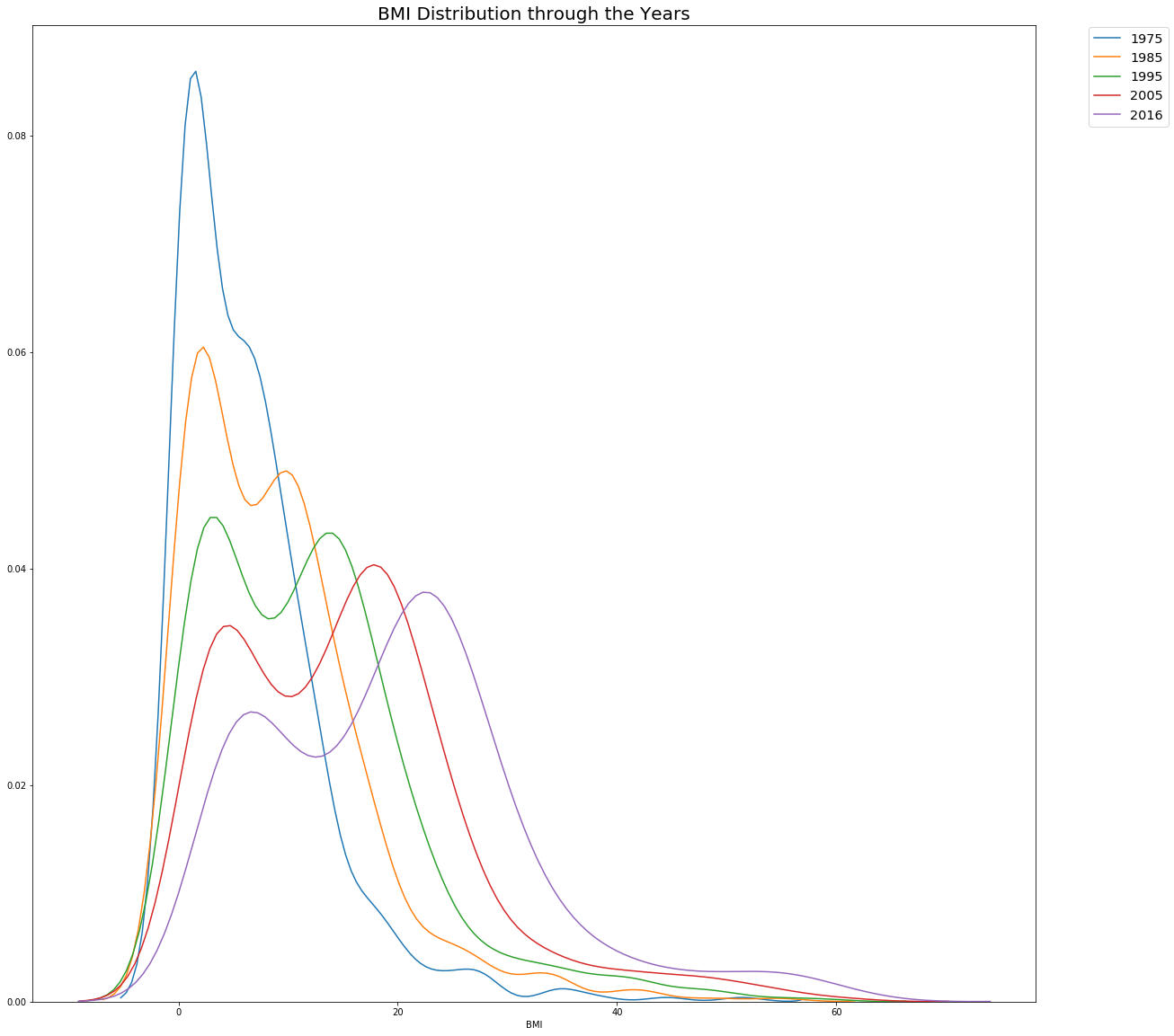
The below code helps us understand how the BMI has changed over the decades. As we can see the distribution starts to move to right, meaning on average we have a higher BMIs than our 1975 counterparts. Very interesting to see the constant dip in the middle range of BMIs.
# Distribution Every 10 Years

sns.distplot(df2[df2.year=='1975'].BMI,hist=False,label='1975')
sns.distplot(df2[df2.year=='1985'].BMI,hist=False,label='1985')
sns.distplot(df2[df2.year=='1995'].BMI,hist=False,label='1995')
sns.distplot(df2[df2.year=='2005'].BMI,hist=False,label='2005')
sns.distplot(df2[df2.year=='2016'].BMI,hist=False,label='2016')

plt.title('BMI Distribution through the Years',size=20)

plt.legend(bbox_to_anchor=(1.05, 1), loc=2, borderaxespad=0.2, fontsize = 'x-large')

plt.show()
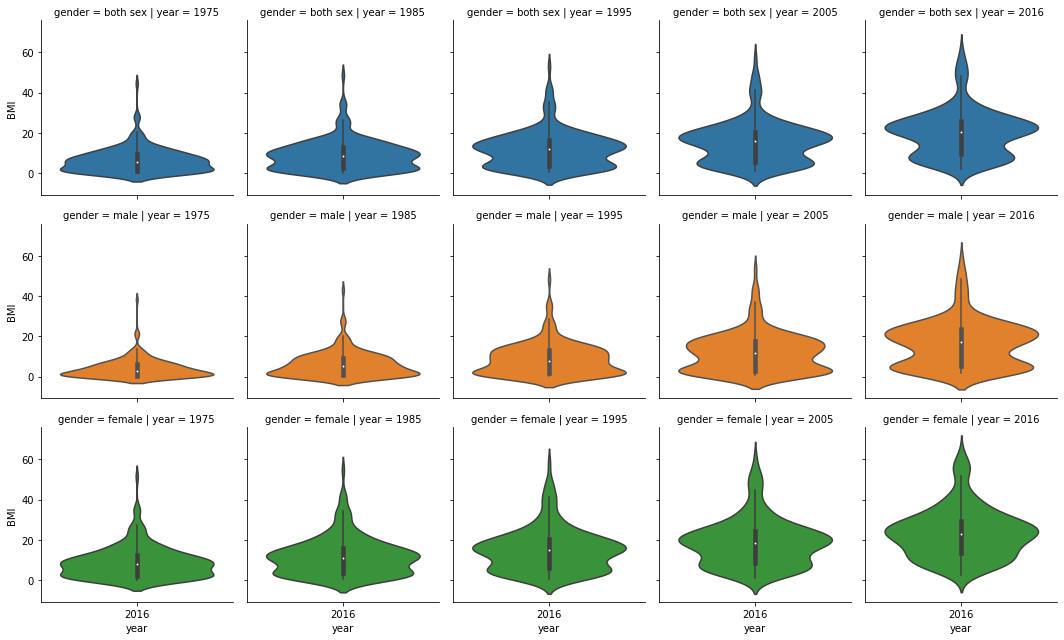
We see a similar distribution change with the viola charts that we use to see differences between both sexes, males, and females. We do see a larger BMI distribution with females than males.
data_temp=df2[df2.year.isin(['1975','1985','1995','2005','2016'])]
g = sns.FacetGrid(data_temp, row = 'gender', col = 'year', hue = 'gender')
g = g.map(sns.violinplot, 'year', 'BMI')
plt.show()
Top 10 Countries based on BMI
data_temp1=df3[df3.year.isin(['1975','1985','1995','2005','2016'])]
g = sns.FacetGrid(data_temp1, col = 'year', sharey=False)
g = g.map(sns.barplot, 'BMI', 'country')
plt.show()

The visual above doesn’t change much over the decades. Seems rather misleading as although I can understand per capita these Polynesian/Micronesian islands may have higher BMI, other countries have increased much over the decades. Below I created a Gif from a Tableau graph using this data to visualize some of the other countries we see increases. As we can imagine, USA and Australia are high but also some middle eastern countries like Egypt and Saudi Arabia.
Final Thoughts
This was a good project to practice some data cleaning on Python which was something I wanted to incorporate in my future projects. I think as an American, sometimes we make assumption about the world and although I’ve known about our obesity problems. It was helpful to get dirty and visualize to truly see what is going on in the world. I never thought of the Middle East having a higher BMI than some Western European countries. Having family in Chile and Argentina, it’s interesting to see their BMIs being slightly higher than the rest of South American countries. From experience I know they have a diet that revolved around white bread and grilled meats. As we can see China and India have lower BMIs, countries where they eat slightly more vegetarian diets. I believe other factor can be attributing to these numbers, such as lack of healthy food options or higher poverty. I think as all things we need moderation and maybe eating some more veggies with that grilled steak!
Note: I did load this data and join it with another dataset, countries of the world, which I use to add regions, population, and other demographics to other data. In this case, we really couldn’t use much of the information since I decided to keep it simple. I will add the code, dataset, and the uploaded dataset used in Tableau.
